UX Lead for a major ecommerce redesign and new product launch
The goal of this project was to launch 4 new ecommerce sites, each with their own distinct brand using a consistent design system across all sites. This included redesigning a site with an existing user base of roughly 1 million monthly visitors.
Design comps were created by the team visual designer with input from me as the project lead.


Highlights
-
Facilitated kick-off activities to establish design principles and workshop a user-centered design canvas
-
Conducted research including a survey of over 11,000 consumers as well as 1:1 user interviews
-
Planned and facilitated multiple rounds of interaction concepting workshops
-
Designed two distinct sites including one highly-regulated customizable consumer product and one ecommerce site with over one million unique monthly visitors
My Role
As the UX Lead my responsibilities included
-
Overseeing a design team of 5 designers
-
Facilitating workshops with the client to set strategic design goals aligned with business goals
-
Working with my design team to provide constructive and timely feedback to ensure quality of all design deliverables
-
Managing relationships with third party partners including copy writers, photographers, contractors, developers, and social media teams
-
Managing timelines, hours budgets, stand-ups, retros, and all client communication
New Product Line
What was the problem?
My team was tasked with modernizing an existing ecommerce site for a brand that is #1 in their market with over 1 million unique monthly visitors. In addition to redesigning their flagship site, we designed sites for two completely new brands as well as a site for a new product category under their existing brand.
For the new product site we were challenged to build out a multi-step process for users to create a customizable product in an industry that’s highly regulated. We were also challenged to understand user's motivations and hesitations for a product that would be the first of its kind.
On a personal note, the subject matter of this project was unique and often not safe for regular work conversations. As the team lead, I took on the responsibility of ensuring that every team member felt comfortable working on this project. For example, during our weekly retros, we identified “red flags” which provided a chance for the team to discuss any part of the work that did not align with our values as people or designers.

User Surveys & Personas
To kick-off our user research, my team surveyed over 11,000 people in the U.S. and abroad. The goal of this research was to better understand people's perceptions of the adult toy industry, personal use of these products, and behaviors around researching, buying, and gifting these products. We learned that, while there are some hesitations, there are huge opportunities especially for couples and younger women.
Just a few slides from our findings report.
Our research helped us identify the user we should be speaking to. We also learned which aspects of the buying process cause the most friction. These findings influenced our design and our content strategy. We conducted interaction concepting sessions around specific sticking points in order to create solutions for the problems identified in research.
One of the primary user personas we created. We identified a number of primary personas and secondary personas as well as affected users and negative actors.
Our surveys gave us a better understanding of the folks we were designing for. That allowed us to create a few "working" personas. Our primary users included the "sexually progressive" couple, the long-distance partner, and the person trying something new. Our secondary user persona was the supportive partner as well as the affected partner who received a product as a gift. We also decide to include a negative actor persona, the "angry ex." This was informed by responses from the survey mentioning fear or concern over an ex partner having access to a customized toy.
Interaction Concepting

Before diving into the UI design phase, we conducted a few rounds of interaction concepting. The goal of these sessions was to generate ideas for mitigating pain points identified in the survey. We kept these sessions internal to our company, but we invited individuals who identified most closely with potential users. These interaction concepting sessions resulted in ideas ranging from ecommerce best-practices, to body-positivity and self-awareness, to workflow improvements for creating customized products. We also used these sessions to inform our content strategy. We updated our information architecture as a result of these sessions to include content more specific to the challenges users might face.
Information Architecture

One of the final iterations of our information architecture.
We created and iterated on a number of sitemaps for this new product site. Our priorities were to inform the user of the unique process in a transparent and respectful way while guiding them through the process of customizing their product. We made updates throughout the process to the sitemap to align with our content strategy, and while we were unable to test the IA shown here, we did pull in input from our interaction design to inform the structure of this site.
Content site & Customization Wireframes
Wireframes for the marketing content site and product customization.
Using the findings from our research and interaction concepting, we started design on the brand new product line first. This product would be the first of its kind, so the ecommerce site was a major business objective.
Although manufacturing and other outside considerations postponed the launch of the site, my team was able to deliver a full ecommerce site with the ability to create and manage custom products within the original, tight timeline. A part of this delivery included a full design system including style guides and component libraries.
Checkout Wireframes
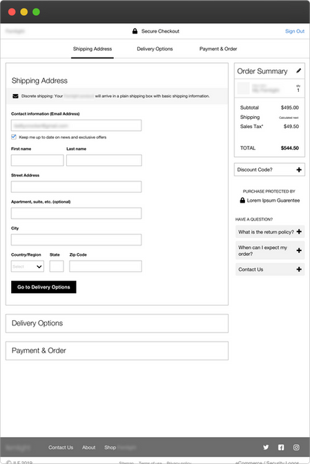
Wireframes for the checkout flow.
In addition to the content site and product customization wizard, we designed a simple and efficient checkout path to support conversion without rushing the user through a serious purchase.
Existing Product Line
Once we completed a bulk of the design work on the new product line, we shifted focus to the existing product site. This is a site for a product that is #1 in the market, and they receive over 1 million unique monthly visitors. Despite this success, our client's website was out of date and difficult to us.
Our biggest challenge for the existing site redesign was to elevate the brand without alienating the client’s very loyal, existing users. This client has a distinct voice that resonates with their loyal customers. We wanted to elevate that voice to attract new users without making the current users feel left out.
To introduce efficiencies to our process and our client's dev team, we leveraged the existing pattern library from the new product site so that our client’s developers could easily manage both platforms. Throughout the design phases of these projects, we maintained an incredible working relationship with the client’s dev team as well as a third party dev team involved in the beginning.

Design Principles
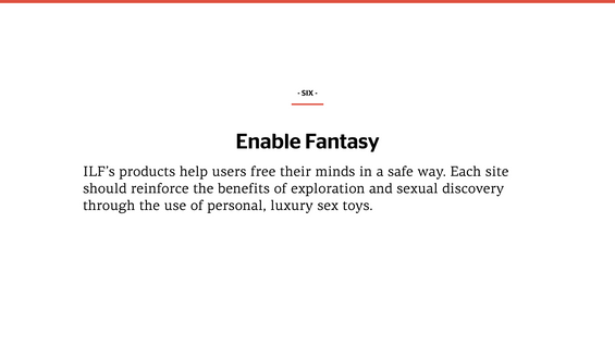
I led an activity during the project kickoff to understand our client's vision. I then wrote these 9 principles which my team had taped up in our project room as a way to keep us focused on the goals of the project.
While the new product site came first in our project plan, the existing product site was a huge priority for the CEO, our primary stakeholder. In order to understand our client's goals and to align everyone involved on the project, I conducted a workshop during our kickoff to identify some design principles. We collected open-ended ideas from the client team, and even conducted a branding activity where we forced the client to select certain adjectives that describe their mission.
We came away with 9 distinct guiding principles that my team used throughout the project. You can see these principle above, but some of the most important include the ability to educate without judgement, the importance of elevating the experience, and the ability to empower our users.
Competitive Analysis
The team compiled an extensive competitive landscape analysis. We looked at our client's direct competitors as well as some analogous lifestyle brands.
Our competitive and comparative analysis was a team-wide effort to look at sites specific to male and female audiences. Our goal was to look at examples from direct competitors as well as more aspirational lifestyle brands to identify best-practices, and to identify where our client fit on a spectrum compared with these brands and where they would like to move to in the future.
This activity was enormously helpful in identifying best-in-class lifestyle brand ecommerce UX patterns as well as understanding how these brands speak to their users.
Homepage, Shop, and Product Landing Page Wireframes


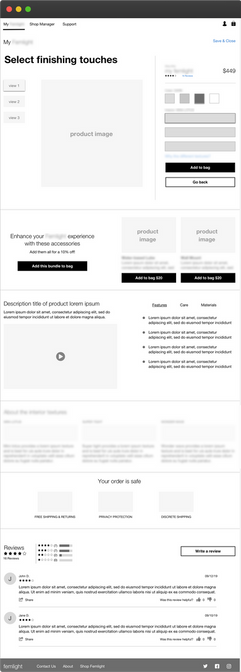
Wireframes of the existing product homepage, shop pages with filters, quick shop options, and bundled product landing pages.
Mobile Wireframes

Mobile designs for the wires above.
Moving into the design phase, I designed a majority of the wireframes for this site including the homepage, shopping and product category pages, a bundled products page, and a "build-your-own" page not shown here. We shared new designs with the client each week, iterating on their feedback as we went.
We spent considerable time looking at all available products and organizing them based on filterable categories that we created. We designed the shop page to support both new and existing users. All products are listed in one place to support casual browsing, but we included high-level and detailed filters so the existing power-user could find exactly what they're looking for.
Usability Testing
We conducted usability tests of both desktop and mobile prototypes of the flagship website. We identified a few areas that didn’t resonate as well with users, and iterated on our initial design work.
We included both current users and folks who had never used the site before. Our goal for this redesign was to create something that would appeal to new users without alienating existing users. Both audiences responded positively to the new design, and we found that usability, navigability, and utility goals would all be met.
Content Strategy
Content strategy was a huge area of focus for us on the new product line and the flagship site. Our client had been making products for men for almost 30 years. They had no experience designing for or speaking to women. For that reason, a few of our interaction concepting sessions focused on how the new product line site should communicate to those users. My team created two separate content guides for both the flagship site and the new product line site. We also created personas specific to each site based on the initial discovery research and findings from the interaction concepting sessions.
What was the result?
From a business standpoint, we met the incredibly high standards of a client who often parted ways with vendors mid-project. We not only delivered an incredible amount of work under tight timelines, but we maintain a positive working relationship with this client today. They've reached out to us with questions about potential future work, and while we await the launch of the new site, we’ve been in regular contact.
On a personal note, this project has resulted in one of the most unexpected successes of my career. This project was one of the largest that Fuzzy Math had taken on, in an area (ecommerce) in which we didn’t have a lot of experience. As the team lead, I was able to not only work well with the client and the other vendors, but I was able to lead a team through a project that could have taken so many negative turns.
One of the partners of my company and the Account Lead of this project was out for paternity leave for most of this project, which really forced me to step up, and I’m proud to say, when members of this team are asked about their favorite work project, this is usually the first one they mention.
What would I do differently?
Because of the sensitive subject matter, we relied heavily on a user survey at the outset of our discovery work. We assumed that users would be more comfortable responding to a survey than having a conversation with strangers. While I think that assumption is mostly correct, I wish we had done more exploratory research. Something we learned after usability testing was that our client’s users were, for the most part, proud of their purchases. Having the additional context from user interviews would’ve really helped.


