Role: UX Lead with 1 UX Designer and a Visual Designer along with our client's Product Owner
Problem: CIRM needed a client portal for customers to access key documents and track investment performance over time.The project overlapped with a major transition between benchmark interest rates, requiring the portal to clearly explain the changes to users. Strict regulatory compliance added complexity, making it a high-stakes, high-impact project blending user needs with legal requirements.
Outcome: Designed and delivered a client portal that supports advisors managing over $100 billion in investor debt, Provided a future release plan and a nearly complete product roadmap for ongoing development, Enabled CIRM’s advisors to reduce administrative work and focus more on strategic client guidance.

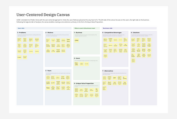
User Centered Design Canvas
I kicked off the project with a User-Centered Design Canvas to align business objectives with user needs.
We mapped users’ problems, motivations, and fears to the client’s solutions to establish a clear foundation and gain alignment across a fractured team.
Interaction Concepting
I facilitated a remote interaction concepting session with financial advisors, technical associates, and executive sponsors.
We rapidly validated early ideas, aligned the cross-functional team on the problem space, and identified potential design solutions.
This generated early design concepts for further exploration and testing.

Feature Roadmap
Along with the Product Owner, I led a feature scoping workshop using internal tool analysis and stakeholder interviews to gather requirements.
We prioritized features using a MoSCoW matrix to focus the first release on critical functionality. This delivered a clear feature roadmap for phased development and future growth.

Design & Usability Testing
From there, we began wireframing a complex client portal featuring data visualizations and document management. We conducted usability tests with a small group of customers, identifying key refinements and backend/content mismatches. We used feedback to refine dashboard content and align client expectations with user needs.


Content Guide
In testing and in an analysis of their current tools, we identified the need for a content guide to address inconsistencies in numerical data presentation.
We created a voice, tone, and data presentation guide inspired by best practices from editorial content sites.
This helped standardize content across the client portal for a more user-friendly financial experience.

Design System
We also developed a comprehensive style guide and component library to support consistent, scalable design.
We collaborated with the client’s development team to streamline implementation and ensure cohesive future updates.
